Learn with

Understanding the Canvas App Interface
In the Canvas app interface, individuals design and customize mobile or web applications. This interface comprises screens, controls (such as buttons and text fields), data sources, and formulas used for creating app functionality. It is possible to personalize the application's appearance, integrate data from various sources, and establish navigation between screens. The app development process includes steps like testing, debugging, and publishing. Canvas apps are a suitable choice for constructing custom, visually appealing applications without the necessity for extensive coding
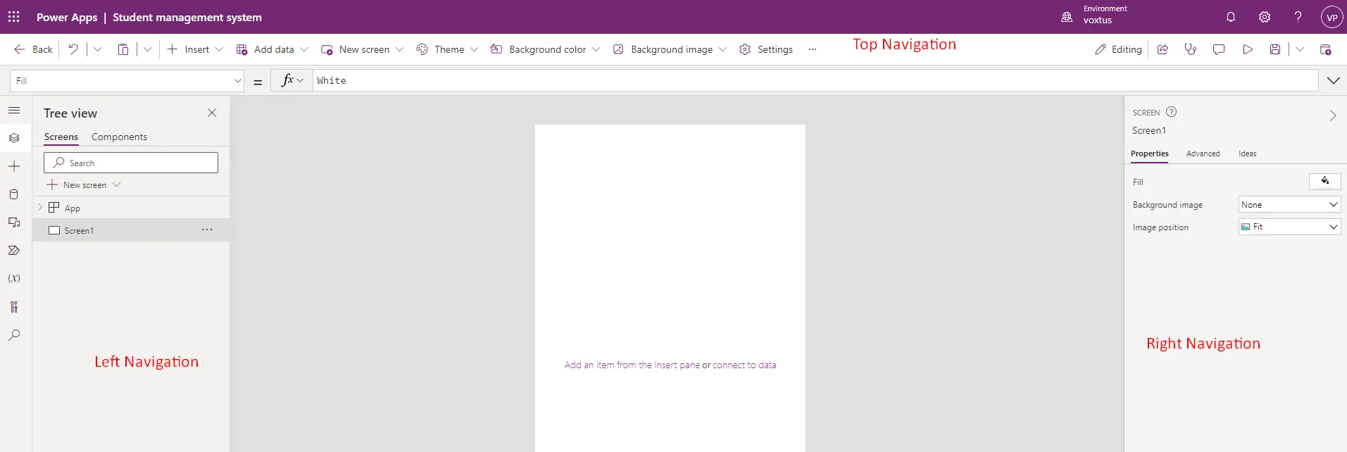
In this layout, the Top Navigation Panel, Left Navigation Panel, Right Navigation Panel, and the canvas are all visible.
The Top Navigation Panel includes:
- Back Button: Utilized to exit the current application.
- Undo Button: Functions to undo a change or go back one step.
- Copy/Paste Button: Employed for copying and pasting various content types.
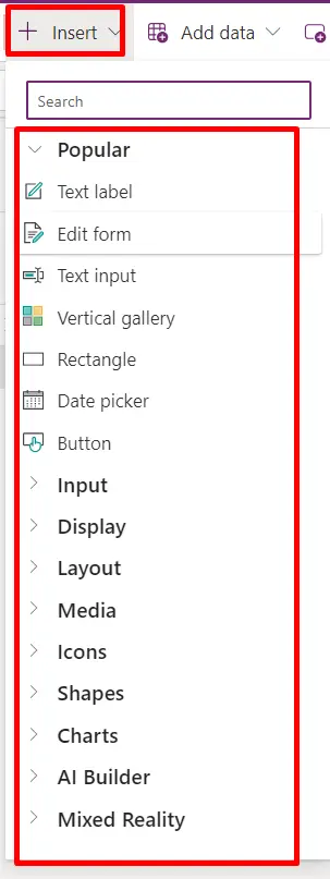
- Insert Button: Allows us to add numerous components such as Galleries, Forms, icons, and more through the insert option.
- Add data: Data sources or connections can be added from here.
- Theme: The application's theme can be customized.
- Background Color / Background Image: Customize the background color or image from this option.
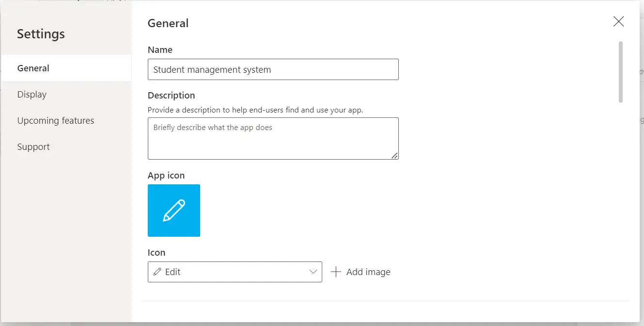
- Settings: In this section, you can modify general settings such as the app name, icon, display settings, and access upcoming features (which are in testing). You can also find support from Microsoft through this option.
Following this, an indicator displays whether the app is in editing mode or view mode.
- Discover a sharing button for easy app sharing.
- Access an app checker for real-time debugging.
- Next, use the comment button for discussing errors or other matters with individuals with whom the app has been shared.
- Then, use the play button to preview the app in the same window/tab.
- Save button is available for saving the app or using the save-as feature.
- Lastly, there's a publish button to publish the app within the solution. Now, let’s proceed to the Left Navigation Panel.
Left Pane:
Displays a hierarchical view of all the controls on each screen or a thumbnail for each screen in canvas app.
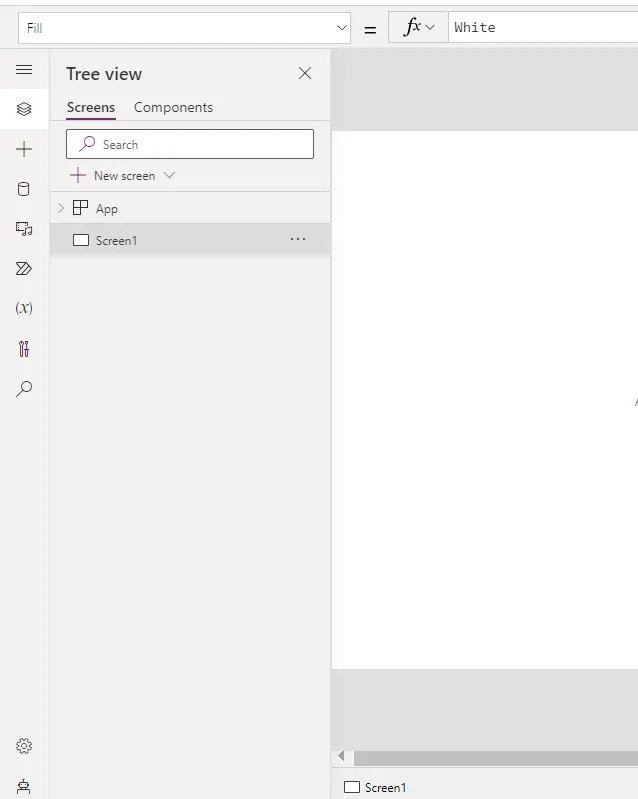
- Within the Left navigation panel at the top, a properties dropdown is visible. These properties pertain to the components added to the screen.
- Beneath that, a hamburger menu is located, housing a tree view that manages the hierarchy of app building.
- Following that is the insert button, which is identical to the one in the top navigation menu.
- Next is "data," which is similar to the data option in the top navigation menu.
- Subsequently, there's "media" where media files like photos or videos can be added and used in the app.
- Afterward, there's the "power automate" option, allowing the creation of flows within the canvas app.
- Then, there's the "variable" option, enabling the search for variables and collections, with a direct search feature.
- Finally, there's a "search" option for searching keywords within the app.
Right Pane:
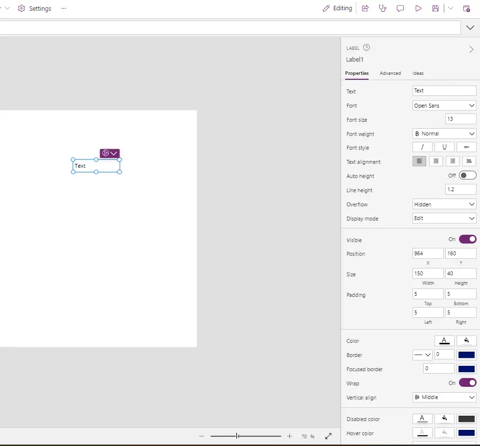
Let's proceed to the Properties menu on the right side. Within it, Custom properties for the selected elements can be find and advanced properties where functions can be added.
