Learn with

Responsive design and layout techniques “need meta data”
Introduction to Responsive Design:
Responsive design in Canvas app Power Apps refers to the practice of creating an application interface that dynamically adjusts and adapts its layout and components based on the screen size and orientation of the device on which it is being viewed.
Key principles of responsive design in Canvas apps include:
- Flexible Layouts: Designing layouts that can fluidly expand, contract, or reorganize based on available screen space.
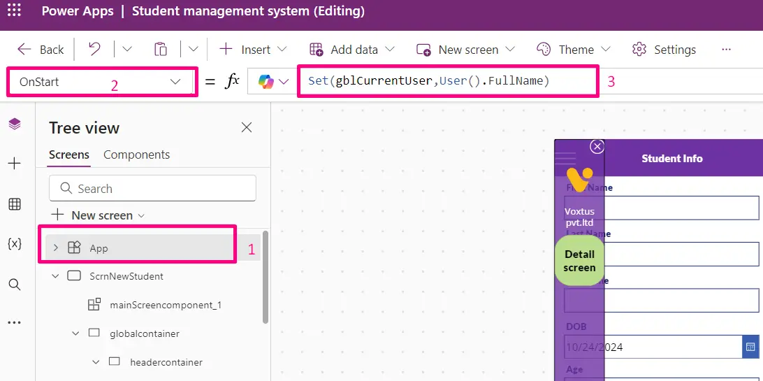
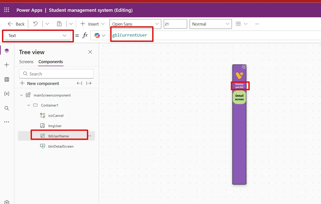
After adjusting the dimensions of the global container, the application will dynamically adapt its height and width to match the screen size. Make the Height & Width to (Parent.height/width) accordingly.
- Grid Systems: Utilizing grid systems to structure the layout, allowing for consistent spacing and alignment across different screen sizes.
From here, users can select multiple templates from the list, allowing them to utilize the same template across various screens. This ensures consistency throughout the app's design, preventing it from appearing disjointed or inconsistent.
- Dynamic Sizing: Components such as images, text boxes, and buttons are set to adjust their size proportionally to the available screen space.
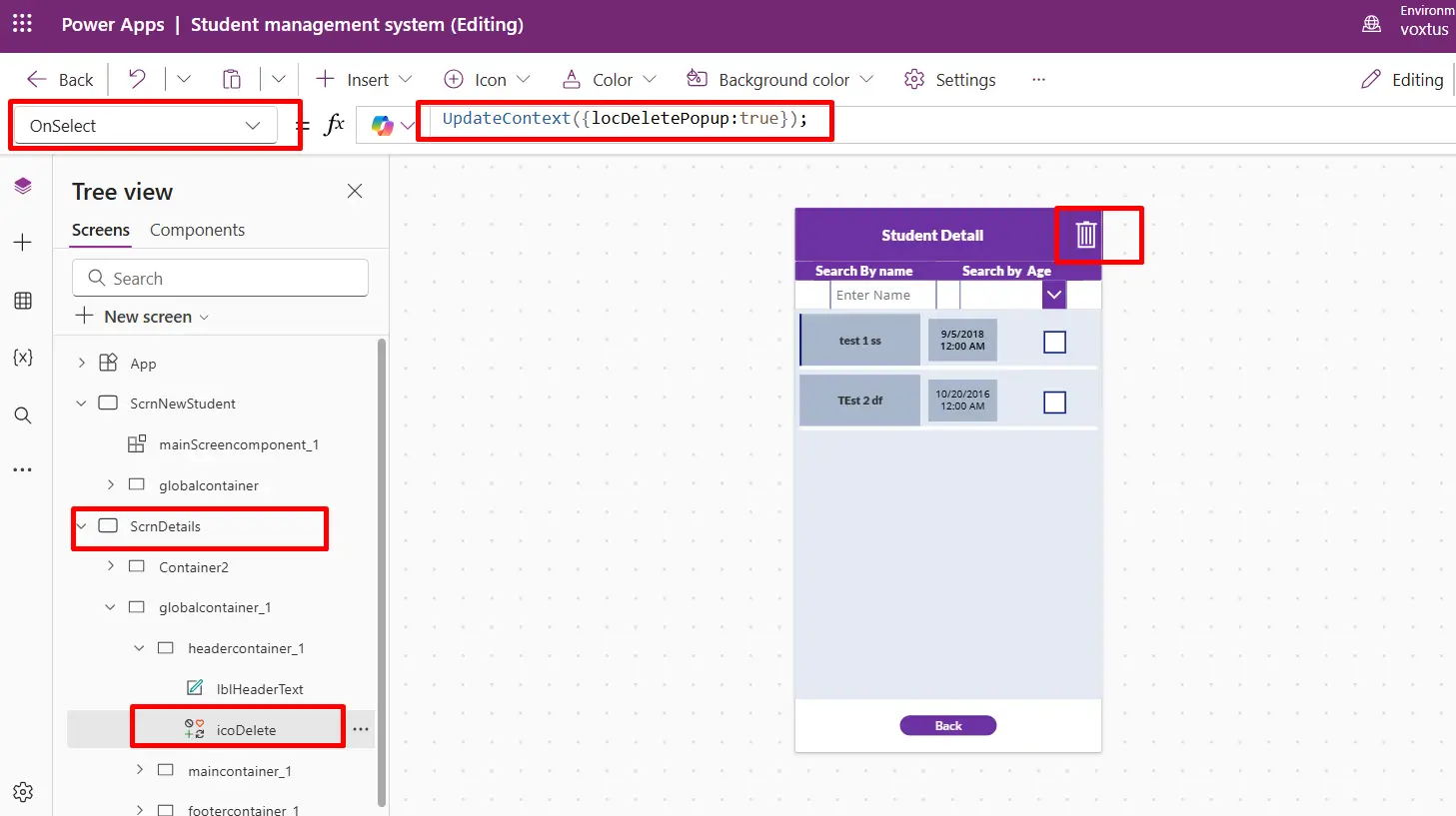
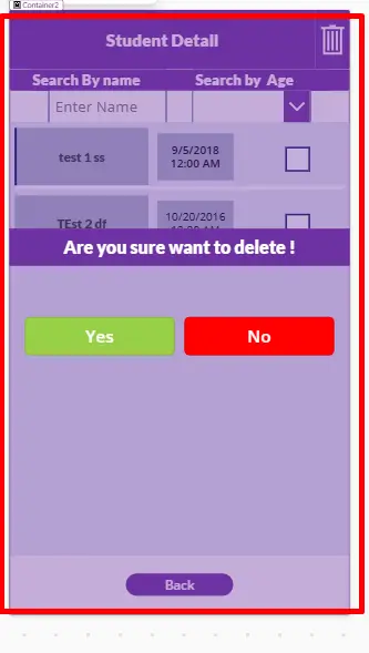
First select the form and make its width to parent.width and after the change the widths of the text box and text labels.
After select the datacard and change its width to same .”Parent.Width ” Currently, the size of the text box doesn't match the screen size. To address this, simply select the text box and text label inside the form, and set their width to `Parent.Width`. This adjustment ensures that the text box and label expand or contract according to the width of the parent container, maintaining consistency across different screen sizes.
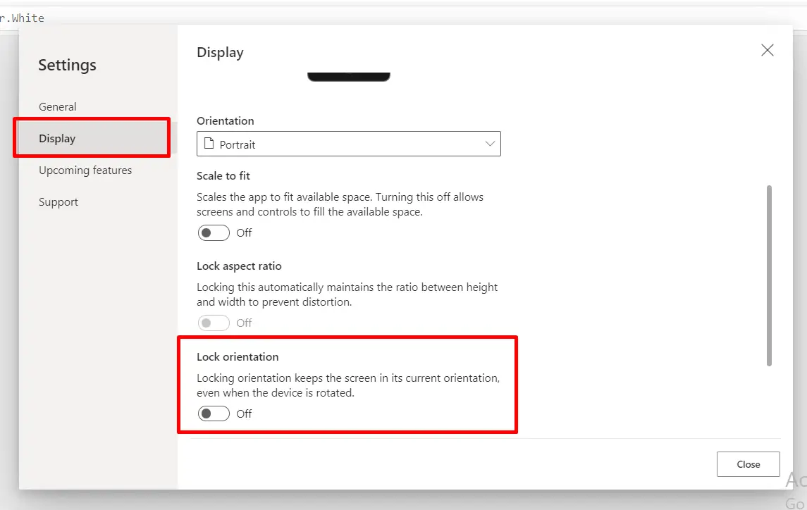
- Orientation Handling: Adapting the layout and content for both portrait and landscape orientations.
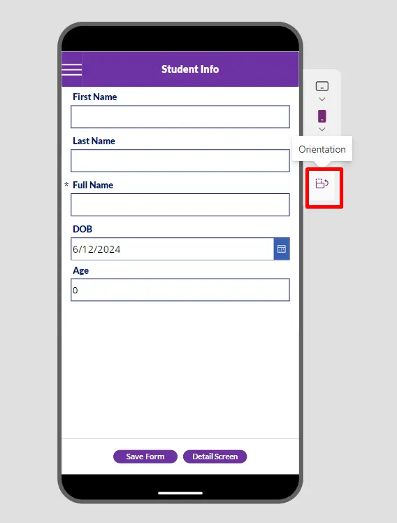
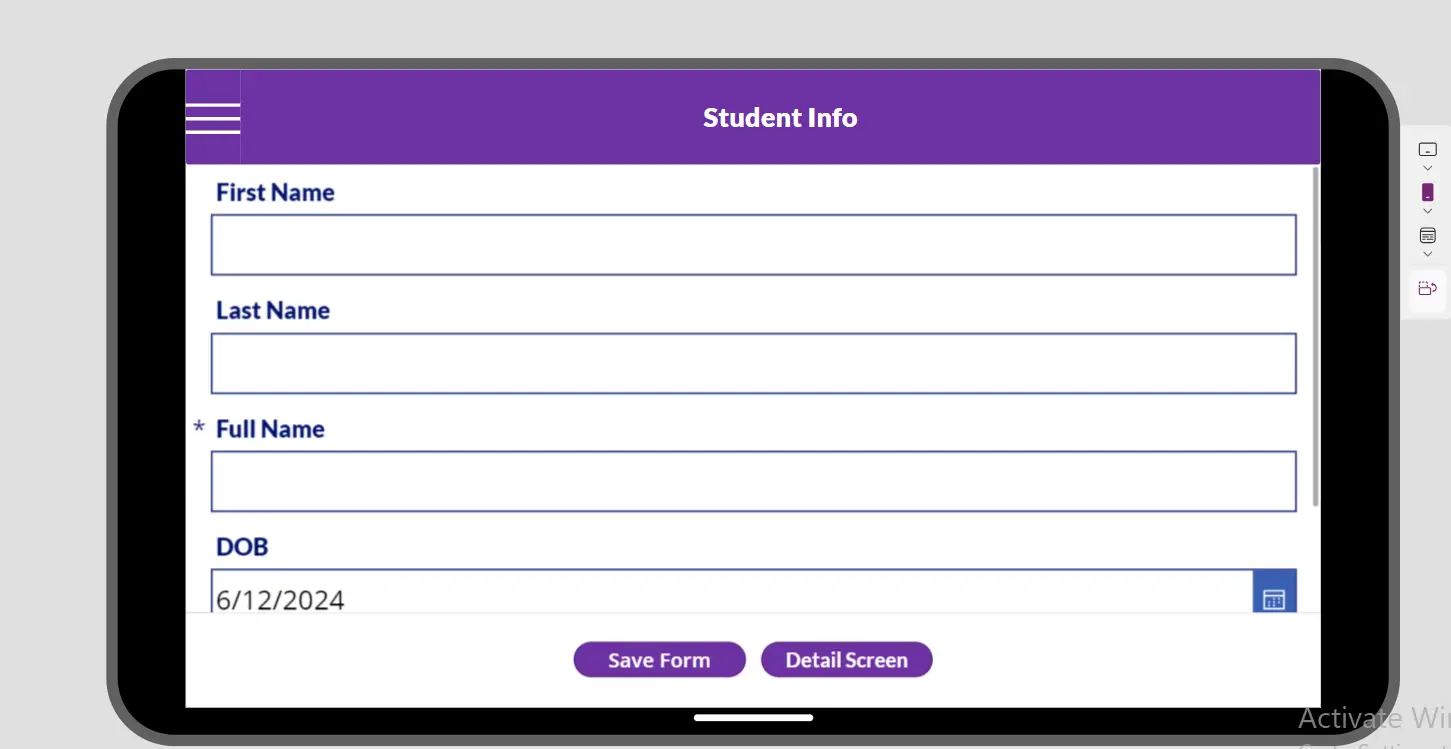
These are the two orientations (Portrait and landscape).
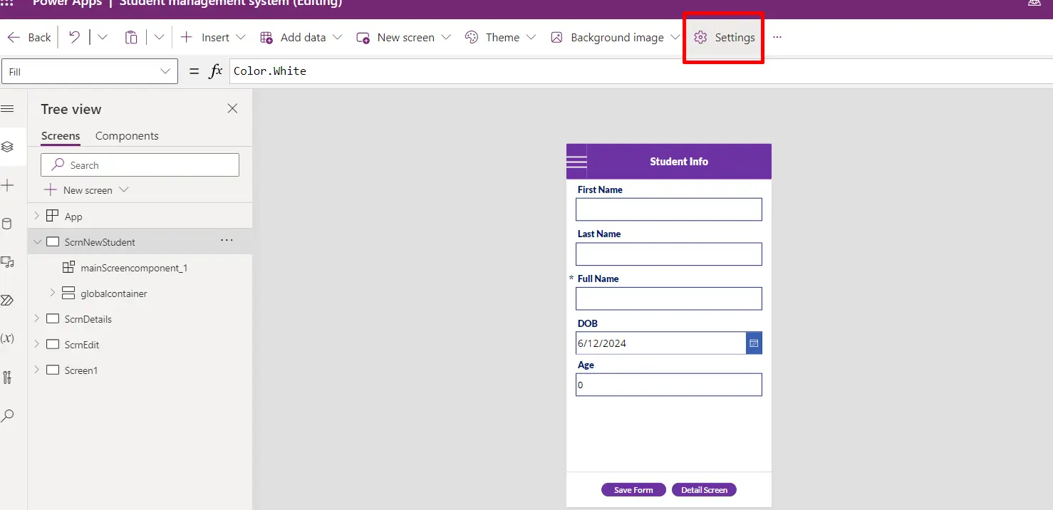
From here you can select weather to lock orientation or not.
