Learn with

Working with Controls in Power Apps Canvas Apps
"We are revisiting a familiar subject that we have previously addressed in our application. In order to provide a comprehensive understanding, we will delve into the intricacies of this topic, offering a detailed exploration of the subject matter."
In Power Apps Canvas Apps, controls are essential elements that allow you to create a dynamic and interactive user interface for your applications. These controls include labels, text inputs, buttons, galleries, and more. In this tutorial, we'll explore how to effectively use these controls to build a user-friendly interface for your Power Apps.
Labels
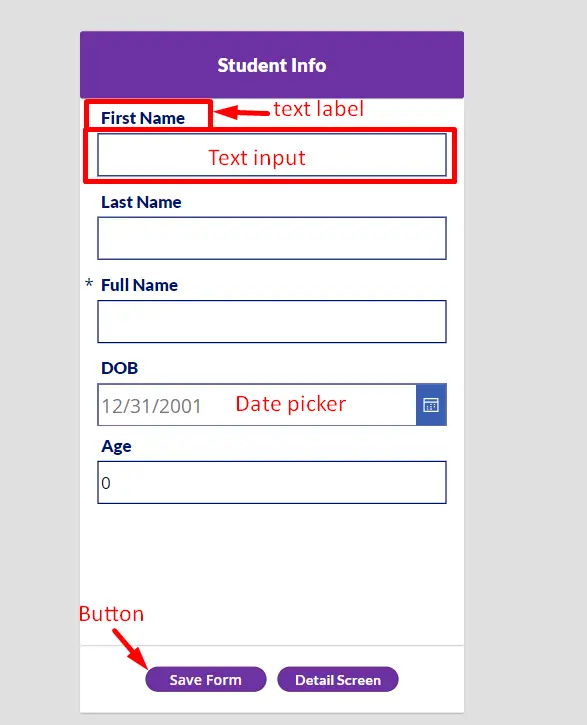
Labels are used to display static text on your app screen. They are ideal for providing information, instructions, or headings to users. To add a label to your app:
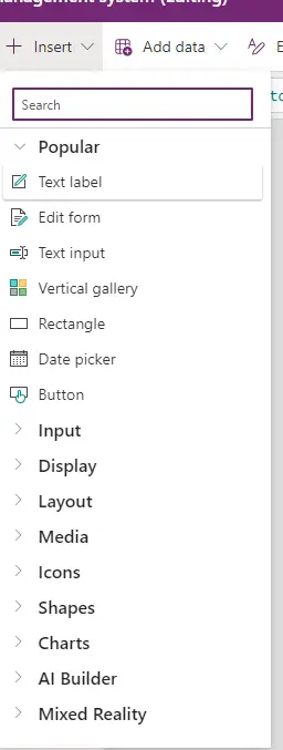
- Drag and drop the Label control from the Power Apps menu onto your canvas.
- Customize the text, font, size, and color of the label to suit your design.

Text Input
Text input controls allow users to enter and edit text. These controls are useful for gathering user input, such as names, emails, or any other textual information. Follow these steps to add a text input control:
- Drag and drop the Text Input control onto your app canvas.
- Adjust properties like default text, maximum length, and format as needed.

Buttons
Buttons are interactive controls that users can click to trigger actions or navigate within the app. To add a button:
- Drag and drop the Button control onto your canvas.
- Define the button's label and configure its “OnSelect” property to specify the action it performs.

Galleries
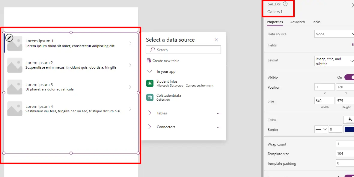
Galleries are versatile controls that display a set of data records, allowing users to scroll through and interact with the information. Follow these steps to incorporate a gallery into your app:
- Add a Gallery control to your canvas.
- Bind the gallery to a data source, such as a SharePoint list or Excel table.
- Customize the gallery layout and design based on your preferences.

Other Controls
Power Apps provides a wide range of controls beyond labels, text inputs, buttons, and galleries. Explore controls like dropdowns, checkboxes, and sliders to enhance the functionality and user experience of your app.
Remember to test your app frequently to ensure that controls function as expected and that the overall user interface is intuitive. By mastering control usage, you can create powerful and user-friendly applications in Power Apps.

In our preceding application development, we meticulously integrated essential components such as text labels for headings, text input controls to facilitate record insertion, a gallery for displaying stored records from the Dataverse, a form for seamless data input, buttons to execute data saving operations and facilitate navigation to subsequent pages, among other refined elements.
